


We’re glad you asked. Data visualisation is the graphical representation of information, typically in the form of a graph, chart, or table.
As a high-level definition, this is fine. But if you want to understand data visualisation, you must look beyond what it is. You must also understand why businesses do it and how it provides value.
Data visualisation is storytelling
Numbers are great. But let’s be honest, they’re a little boring. Present someone with a table full of numbers and, chances are, you’ll see their eyes glaze over within minutes.
Data visualisation lets you look beyond the numbers and see the insights they contain. About your business. About your customers. About your industry. More than that, it helps you tell compelling stories that can captivate, educate, and inspire your audience.
Think about the way you track visitors to your website, for example. Do you take monthly snapshots, record the data into an Excel spreadsheet, and share it across your business? Or do you use the data to create a dynamic graphic on your marketing dashboard that instantly shows the peaks and troughs?
Presenting information visually makes it more accessible and helps you to:
- Spot trends, patterns, and relationships
- Identify errors or inconsistencies
- Share strategic insights across teams
There are many different types of data visualisation. The trick is knowing when, where, and how to use them.

5 common types of data visualisation and when to use them
Bar chart
If there was a book called My First Data Visualisation, bar charts would be chapter one. From primary schools to the boardroom, we see bar charts everywhere. And there’s a good reason for their enduring popularity: they’re easy to understand.
Bar charts bring clarity to complexity, thanks to their simple two-axis structure and bold rectangular bars. The horizontal X-axis shows separate data categories, and the vertical Y-axis represents the scale. For example, if you were tracking monthly product sales, the X-axis would record the month and the Y-axis the number or total value of units sold over that period.
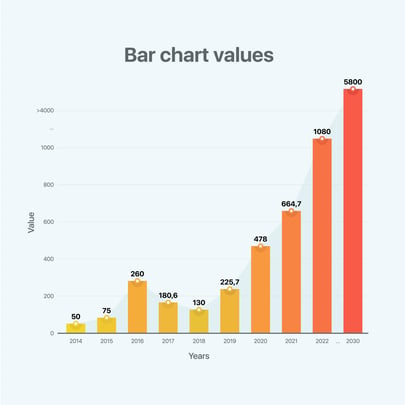 Use bar charts to:
- Compare different groups
- Track changes over time
- Identify peaks and troughs
Line graph
Like bar charts, the line graph is one of the most recognisable types of data visualisation.
Line graphs use dots to represent individual data points which, when joined together, create a continuous line. Typically, the X-axis measures time (days, weeks, months) and the Y-axis scale (website visitors, new contacts, sales).
Line graphs can include one or multiple lines, depending on how many groups you want to compare. But for the best results, you should avoid using more than four separate lines on a single graph.
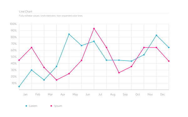
Use line graphs to:
- Plot trends, patterns, and relationships
- Track small, incremental changes over time
- Review past performance and project future developments
Pie chart
Pie charts are the go-to data visualisation for organising, presenting, and interpreting datasets with only a handful of categories – ideally no more than five or six. This makes them especially useful for showing percentages.
Simplicity and accessibility are key to the pie chart’s success. Each category or segment of the circular graphic represents a percentage and is organised according to size. The higher the percentage, the larger the segment.
Pie charts offer a two-dimensional, top-down view of your data. This makes it easy to see how individual segments contribute to the whole. For example, how each marketing channel contributes to lead generation.
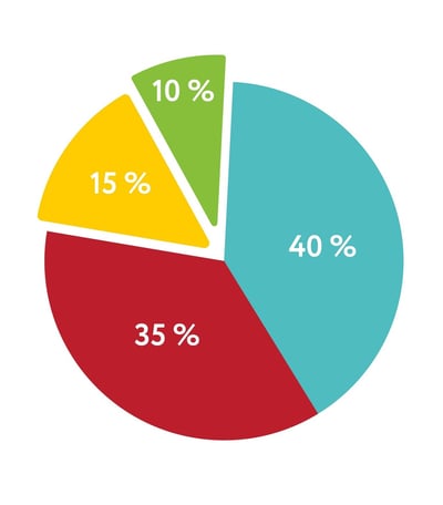 Use pie charts to:
- Gather and share insights quickly
- Identify highest and lowest contributors
- Compare percentage shares
Radar chart
Unlike most of the visualisations in this article, radar charts forego the binary X/Y-axis structure in favour of a circular, wheel shape. Each axis or spoke of the wheel represents a single data point that radiates outwards from the centre. They’re connected via a series of circular and straight grid lines that create polygonal shapes to reveal patterns in your business data.
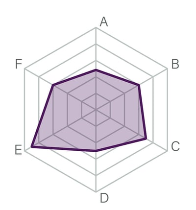 Radar charts represent quantitative data across multiple dimensions. In other words, they let you quickly compare several data points. For example, you could use a radar chart to rate website performance in different categories, such as page load speed and responsiveness.
Bear in mind, radar charts can grow out of hand quickly if you try to plot too much data.
Use radar charts to:
- Visualise small or medium-sized datasets
- Compare multiple data points at the same time
- Spot outliers
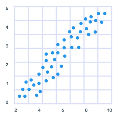
Scatter plot
Sometimes called scattergrams, scatter plots help you make sense of large datasets. Each dot represents a separate data point. Viewed together, these tiny dots can reveal powerful insights.
They may look chaotic at first glance. But scatter plots are great at establishing patterns, understanding distribution trends, and revealing relationships between two variables or datasets. For example, the effect of website performance on conversion rates or retail sales on inflation.
Use scatter plots to:
- Understand positive/negative correlations
- Reveal distribution trends
- Spot outliers in large data sets
Why data visualisation matters
Aristotle called humans political animals. But we’re also visual animals.
We understand images and graphics far easier than numbers and text. Anyone who’s ever had to find meaning in a large Excel spreadsheet can attest to the benefits of a clean bar chart.
Data visualisation isn’t only about making information more accessible. Studies show that businesses with data visualisation capabilities are twice as likely to rank in the top quartile for financial performance in their industry. They’re also 5x faster at making decisions.
So, it’s not only your team that will thank you for embracing data visualisation. Your bottom line will, too.